Understanding POUR
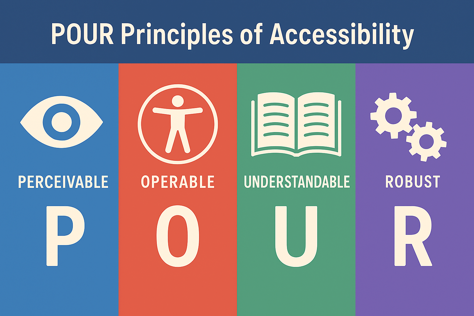 Meeting the accessibility guidelines isn’t just about compliance—it’s about ensuring every learner can access, engage with, and succeed in their course. At the heart of the guidelines (WCAG 2.1 Level AA) is the POUR framework, which outlines four foundational principles of accessible design:
- Perceivable – Students need to be able to take in the information in a way that works for them. This means providing content in multiple forms—like captions for videos or alt text for images—so that no matter how a student sees, hears, or senses the material, they can still access it.
- Operable – Students should be able to use and navigate course materials without struggle. Whether they use a mouse, keyboard, screen reader, or touchscreen, every button, link, or activity should work smoothly.
- Understandable – Students should be able to make sense of what they see. Clear language, predictable layouts, and consistent instructions help reduce confusion so learners can focus on the content rather than figuring out how to navigate the course.
- Robust – Course materials should hold up across different devices and assistive technologies. Whether a student is using a laptop, phone, screen reader, or magnification software, the content should remain usable and dependable.
Why POUR Matters for Course Materials
POUR gives faculty and course designers a practical lens for reviewing and improving the accessibility of their materials. Instead of thinking about accessibility as a checklist, it reframes the work as designing a learning experience that welcomes every student from the start.
Video Example
Imagine a course module built around video lectures. If the video lacks captions (Perceivable), has buttons that can’t be accessed via keyboard (Operable), includes unclear navigation or inconsistent labeling (Understandable), or relies on a player incompatible with screen readers (Robust), the result is a learning barrier—not because of the student, but because of avoidable design choices.
When that same module includes accurate captions and transcripts, keyboard-accessible controls, consistent structure, and a compatible player, it becomes accessible not only to students with disabilities but also to multilingual learners, students in noisy environments, and anyone accessing the course on different devices.
Slide Deck Example
Now consider a faculty member sharing a slide deck for an upcoming unit. If the slides use tiny text (Perceivable), rely on color alone to convey meaning (Understandable), or include images without alt text (Perceivable again), students may miss key ideas. If the slide order jumps around in the outline view because elements weren’t added in a logical sequence (Operable/Robust), screen reader users will find the deck nearly impossible to follow.
A more accessible slide deck might use readable fonts, strong color contrast, and alt text for meaningful images. The reading order would flow naturally from title to bullet points, making it easy for screen reader users to follow. Charts would include labels or brief explanations, ensuring that all students—regardless of how they access the material—can understand and engage with the content.
Designing with Accessibility in Mind
By aligning materials with accessibility guidelines and intentionally designing with POUR in mind, you can create more flexible, usable, and effective learning environments. Accessibility becomes less about meeting external requirements and more about ensuring every student has an opportunity to learn and participate fully.